Top Color Trends for Spring 2019
As 2018 is coming to a close, it is time to start looking ahead to 2019 and how you might be able to redecorate in the new year! If you are beginning to plan your New Years goals, and one of your intended goals is going to be to renovate a part or your entire house, you will want to know what colors will be in trend for 2019.
Interior paint colors change seasonally and annually. It is essential for you to know what colors will be in fashion before you start planning your renovation. Omorfia Designs can help you decide what colors are trending and what works best for you.
Omorfia is the word for beauty in the Greek language, and that is what they will bring to your home. The designers at Omorfia want to take your ideas and create something in your home you will be proud to show off and live.
Ashley Dupert, our lead designer says, “We design beautiful spaces for beautiful people”.
How to Choose Your Colors
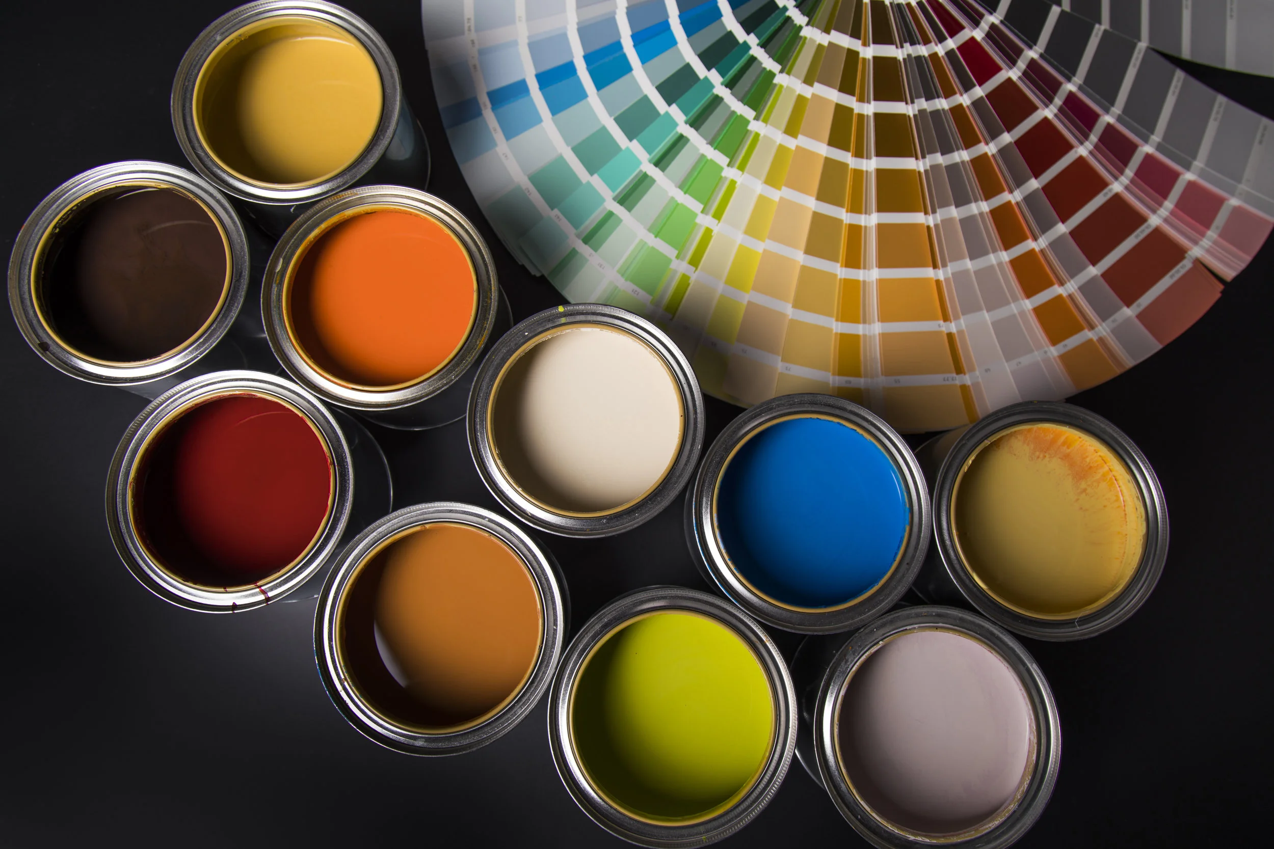
It may also be helpful to look at paint companies like Benjamin Moore or Sherwin Williams. These are great companies to listen to when planning any painting project.
If you want to go at it alone selecting colors that appeal to you, here are some tips for color palettes you can look forward to seeing in the spring of 2019. However, if you are looking for help in your quest to renew the look of your house, the experts at Omorfia Designs are here to help.
Spring and Summer 2019 Forecasts
The forecast for spring and summer 2019 colors all revolve around calm tones, with an overarching theme of love. This means soft tones in blue and teal, as well as palettes of orange, green, and purple, lend itself to beautiful rooms with life-giving feelings.
Looking ahead at the color forecast for spring and summer 2019, there are a variety of colors and color combinations that are unique and fresh, and that pair well together. It is easy to see the inspiration from nature, as well as love.
Pantone
The Pantoneview Colour Planner for the spring and summer of 2019 offers “wistful, unrequired and blooming to treasured, transporting and celebrated” colors of love. These feelings present themselves throughout our lives, and we find them in many different and unique aspects. Similar to the notion of love, the arrangement for spring colors are complicated and constantly changing.
Forecasted colors for spring and summer 2019 will be evident across the board, from women’s clothes to interior paint, from furniture to clothes for the family, even exterior paint. You will see evidence of this motivation wherever you look next spring. If you are looking for interior paint colors to don the walls of your house, you will be pleased with this forecast.
Core Colors
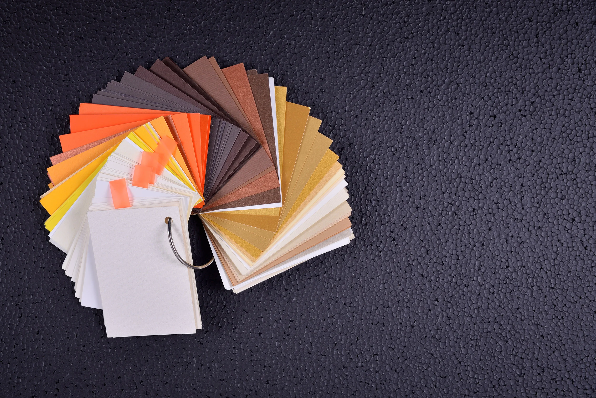
For a calm and relaxed palette, these core colors will combine with bold tones and muted hues and will work well with many other palettes. This palette features a soft blue and green base, with accented orange, yellow, and pinks and combines some dark and black tones to balance out the feeling.
This combination will be beautiful on the walls of your home in interior paint colors, as well as in the accents you choose to decorate the rest of your home. You will find no shortage of inspiration when it comes to finishing the look of your home if you start with these core colors.
Tropical
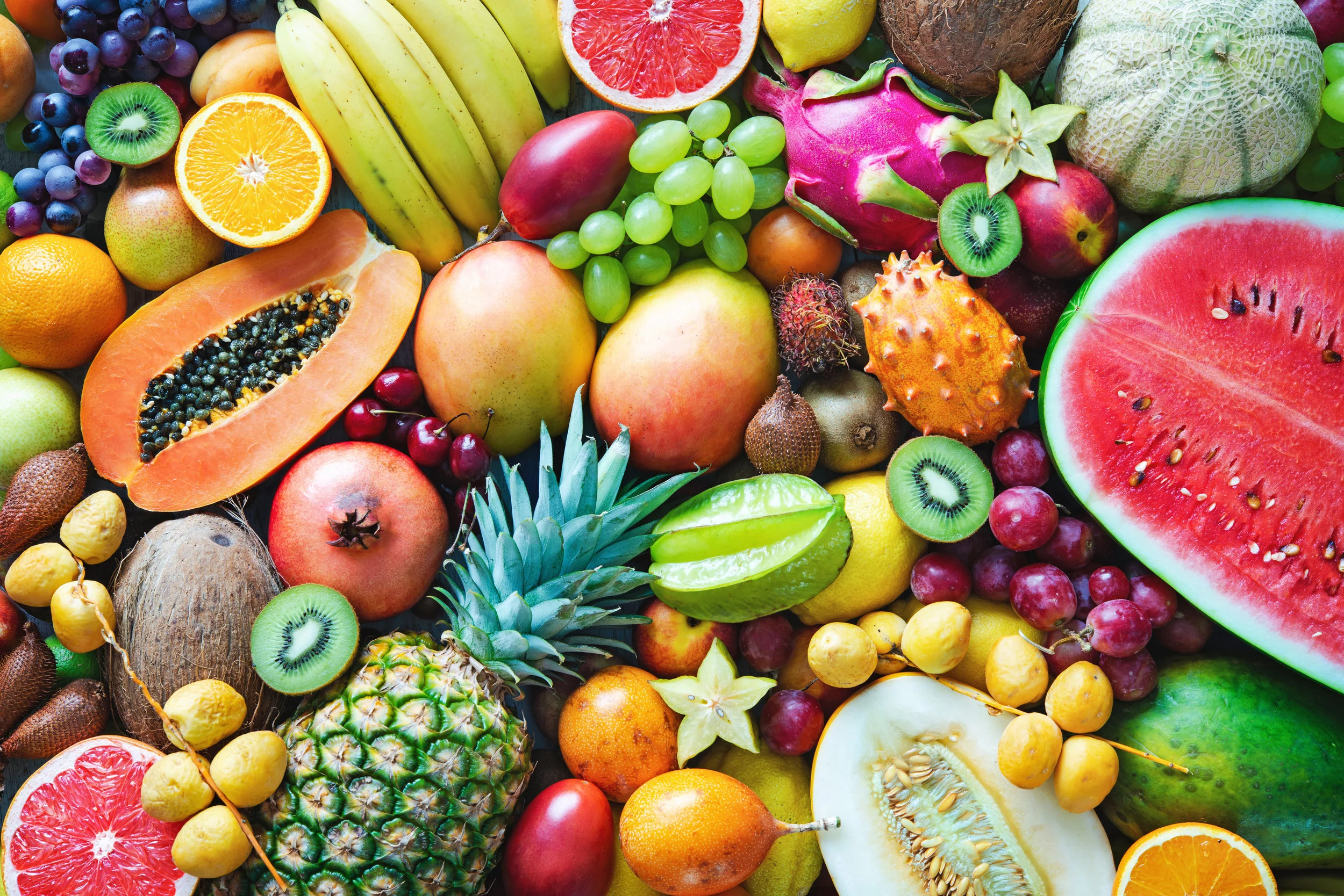
Combine the core palette with tropical accents for a unique and fun look. These orange, mint green, deeper red, and yellow tones will stunningly compliment the core palette. Think kiwi, strawberry, watermelon, mango, and cantaloupe.
Dance
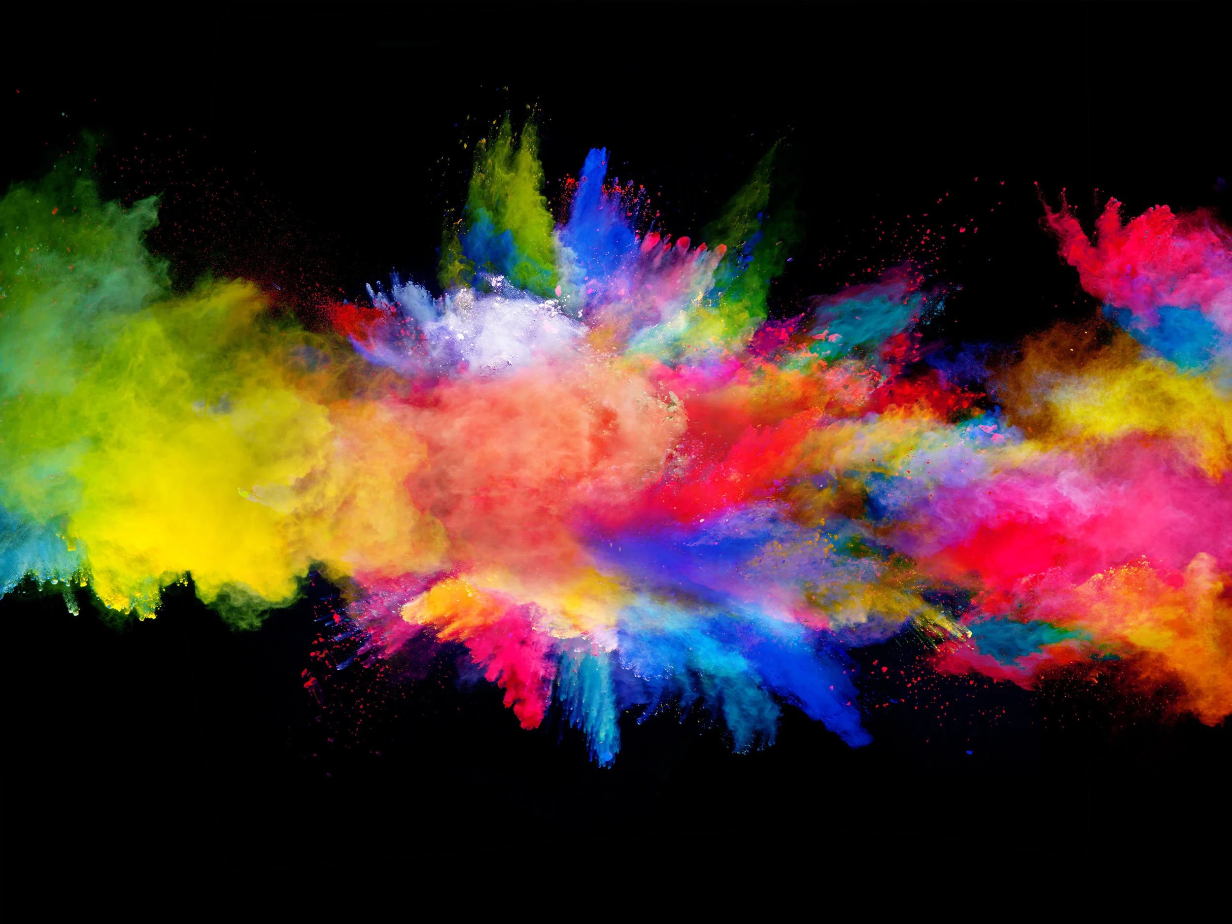
Inspired by techno dance and music, this palette features a black to a white range with bright colors pulled from along the spectrum. Radiance and bright tone abound in this lively palette. An image of fireworks exploding in a night sky comes to mind as you imagine this palette.
Fantasia
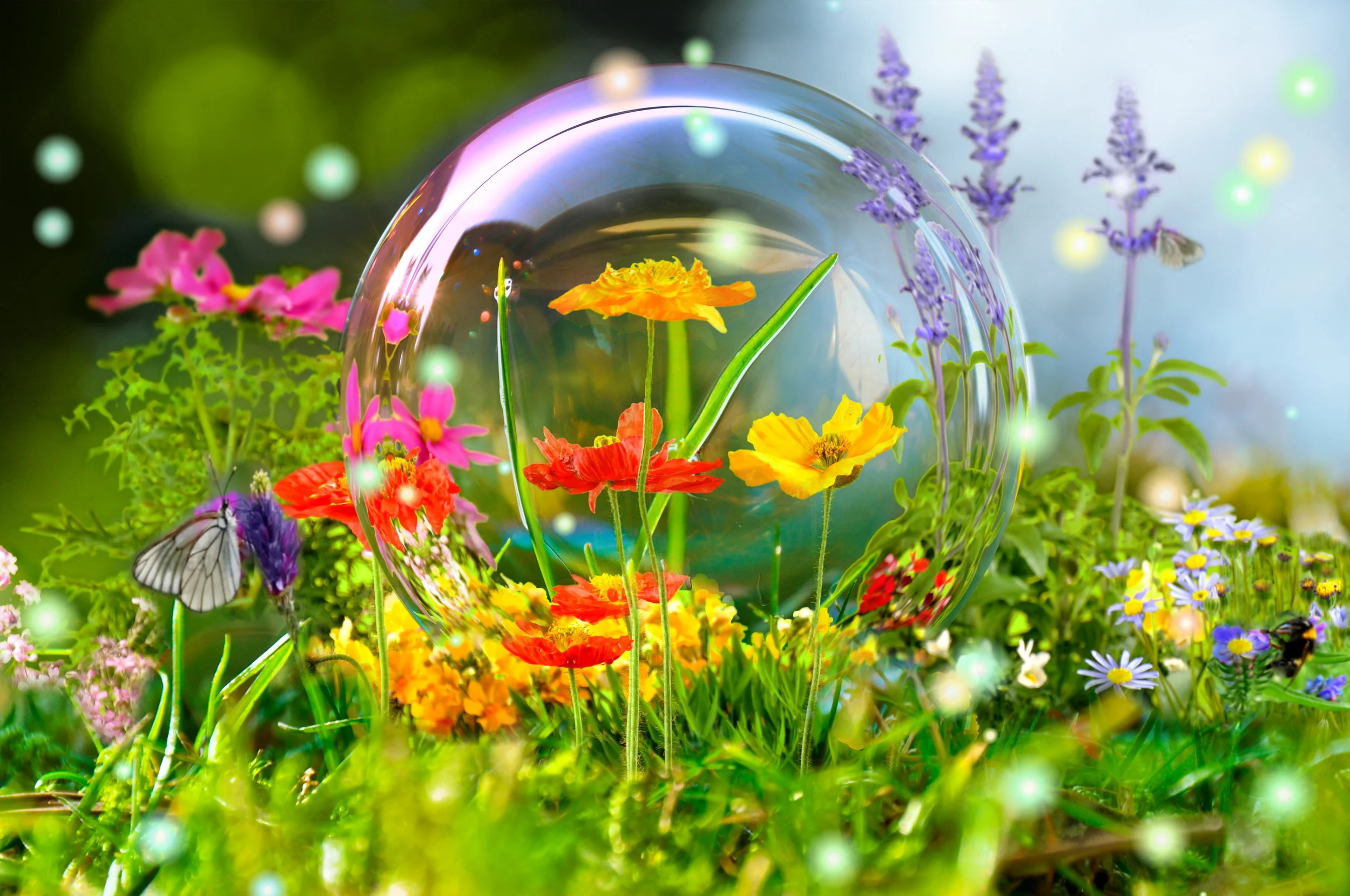
Inspired by the free-form music with a familiar improvised style, this color palette is bright and beautiful and unrestricted. Colors collide to create new and unique combinations. In this bright palette, you can enhance the bright colors or tone them down with more natural hues. Beautiful oranges, purples, blues, and greens abound.
Jungle Jam
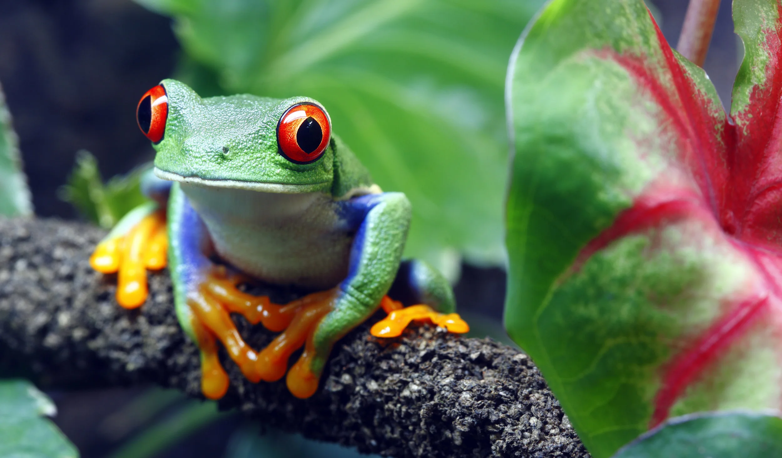
Designed with a nod to natural tones and elements, this palette features intense blues and beautiful greens with red and orange in the mix to keep things bright. Picture a tropical tree frog or beautiful flowers, and you can imagine the unique aspects of this palette and how beautifully it pares with the core palette.
In Conclusion
Imagine enjoying the blooming trees without having experienced the dark of night. Without the hushed tones of dark, it is impossible to recognize the light. By paring these dark tones and bright colors, we can reflect nature and appreciate the innate beauty we see around us. By using these colors, we can bring the beauty of nature into our homes.
Omorfia means beauty. If you are overwhelmed choosing colors for your home, consider calling the experts at Omorfia Designs. They will come into your home and bring your ideas to life.
They have the experience needed to draw out the beauty of nature and love and display it in your home for you to enjoy every day.
Right now, they are offering a $99.00 special for a 90-minute personal design consultation. Or, if you are unsure, try talking with them for 30 minutes with a free phone consultation.
Omorfia Designs and their expert staff are waiting to hear from you so they can bring your ideas to life. Give them a call and see what they can do in your home.

